
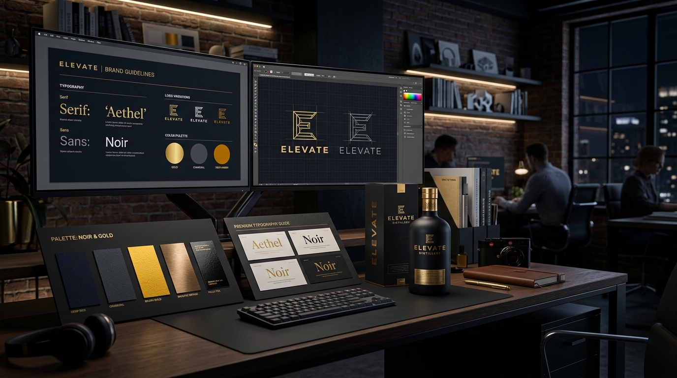
The Psychology of Visual Perception: Why Design Dictates Your Price
Imagine you walk into a cafe in Jhamsikhel, Lalitpur.
The cafe has warm amber lighting, sleek minimalist oak furniture, custom ceramic coffee mugs with a debossed gold emblem, and a menu printed on heavy textured cardstock with elegant typography. When the bill arrives and you see NPR 450 for a cappuccino, you pay it without batting an eye. In fact, you take a photo of the latte art and share it on Instagram.
Now imagine walking into a local tea stall down the street with cracked plastic chairs, fluorescent flickering tube lights, and a menu handwritten on greasy cardboard. If that shopkeeper tries to charge you NPR 450 for the exact same cup of coffee, you will be outraged and refuse to pay.
The coffee beans might be identical. The water temperature might be identical. But the perceived value created by visual aesthetics, environment, and branding completely determines how much money customers are willing to happily hand over to your business.
In the digital realm, your graphic design is your cafe interior. It is the single most powerful subconscious signal that tells a potential client whether you are an established, world-class enterprise worth premium fees, or an amateur budget outfit that can be bargained down.
The 'Canva Clone' Trap: Why Generic Templates Hurt Your Business
Canva is a wonderful tool for making a quick birthday card or a school presentation. But when a commercial business relies exclusively on default Canva templates for its marketing, disaster strikes:
- Your Brand Has No Unique Identity: Because millions of people use the exact same 10 trending free templates, your education consultancy's Instagram post looks identical to a dental clinic's post in Pokhara, which looks identical to a clothing shop's post in Butwal.
- Zero Visual Consistency: On Monday you use purple rounded bubble fonts; on Wednesday you use orange italic serif letters; on Friday you use neon green boxes. Your followers never develop visual brand recognition.
- Low Perceived Authority: Discerning customers with real money can spot a 5-minute amateur template immediately. It subconsciously signals: "If this company cuts corners on their public image, they will probably cut corners on their service quality too."
Direct-Response Ad Creative Design: Stopping the Scroll
When designing social media ads for Meta, TikTok, or Google Display, artistic subtlety will get you ignored. You are competing against wedding photos, political breaking news, and viral funny memes.
To stop a moving thumb on a smartphone screen, your graphic design must master Direct-Response Visual Principles:
| Design Principle | What Most Amateurs Do (Fails) | What High-Converting Creatives Do (Wins) |
|---|---|---|
| Text Density | Stuffing 80 words of tiny text explaining every single feature | 1 bold, punchy headline (under 8 words) with massive contrast and high readability |
| Visual Contrast | Muted pastels or dark grey text on dark black backgrounds | Vibrant high-contrast focal points (e.g., golden brand accents against sleek dark charcoal) |
| Human Connection | Generic Western stock photos of smiling models in foreign offices | Authentic, high-resolution photography of real Nepali people displaying genuine emotions |
| Visual Hierarchy | All elements compete for attention with equal size | Clear 3-tier hierarchy: 1. Main Hook → 2. Supporting Proof → 3. Call-to-Action Button |
The 4 Elements of an Indestructible Brand Identity System
A professional brand identity is not just a logo PNG file. It is a comprehensive, coherent visual language that encompasses 4 foundational assets:
1. Primary & Secondary Logo Lockups
Your logo must be versatile. You need a full horizontal version for website headers and letterheads, a compact square/circular icon for social media avatars (like our 48px avatar badge), and a monochrome white/black version for dark backgrounds and print merchandise.
2. Curated Color Palette (60-30-10 Rule)
Never use random rainbow colors. Standardize a strict palette:
- 60% Dominant Background Color: (e.g., Deep modern dark charcoal
#070709or clean minimal white). - 30% Structural Secondary Surface: (e.g., Elevated cards
#12131b, borders, neutral slate typography). - 10% Vibrant High-Impact Brand Accent: (e.g., Energetic gold
#faa21aor electric emerald) reserved exclusively for buttons, active badges, and key focal points.
3. Typography Pairing Hierarchy
Pairing two complementary typefaces creates instant elegance:
- Heading Font: A bold, modern, confident sans-serif (such as Outfit or Cabinet Grotesk) for impactful titles and numbers.
- Body Font: A clean, highly legible typeface (such as Plus Jakarta Sans or Inter) engineered for maximum readability on small mobile screens.
4. Standardized Social Media & Marketing Templates
Create a modular library of 10 to 15 pre-designed templates for carousel posts, client testimonials, quote boxes, product showcases, and story announcements. This ensures your brand looks cohesive and recognizable in every customer's feed.
Typography & Color Theory for the Nepali Market
Colors evoke powerful psychological responses that vary across cultures. In Nepal's commercial landscape:
- Gold & Amber (#faa21a, #d98207): Associated with prosperity, premium quality, energy, performance, and warmth. Highly effective for finance, marketing, luxury hospitality, and high-ticket consulting.
- Deep Navy & Royal Blue (#1e3a8a, #0a66c2): Evokes security, stability, institutional trust, and professionalism. The gold standard for corporate banking, insurance, IT solutions, and legal consultancies.
- Emerald Green (#10b981, #059669): Signals health, vitality, organic purity, environmental freshness, and wealth. Ideal for clinics, wellness spas, agricultural exports, and payment apps (eSewa).
- Crimson Red (#dc2626, #b91c1c): Triggers urgency, excitement, appetite, and passion. Powerful for fast-casual food delivery, festival sales promotions, and urgent flash deals.
Packaging & Retail Shelf Impact (Bhatbhateni to Instagram)
For FMCG goods, cosmetic skincare, organic teas, specialty coffee, and fashion apparel, your packaging is your primary marketing billboard.
When your product sits on a crowded shelf at Bhatbhateni Supermarket or Big Mart alongside 30 competing brands, a shopper will spend less than 2 seconds scanning the row.
Winning packaging design requires:
- Bold Minimalist Contrast: Avoiding cluttered, chaotic text in favor of clean, bold product naming and distinct color blocking.
- Tactile Quality & Premium Finishes: Utilizing matte laminations, spot UV embossing, foil stamping, and eco-friendly craft textures that feel luxurious in the customer's hands.
- Instagrammable Unboxing Moments: Designing packaging that looks so stunning on camera that customers naturally pull out their phones to film an unboxing reel, generating free viral organic promotion for your brand.
How to Measure Design ROI: From Vanity to Profit
Skeptical business owners often ask: "How do I calculate the return on investment (ROI) of hiring a professional graphic designer?"
Here is how premium design directly impacts your financial bottom line:
- Higher Click-Through Rates (CTR) on Paid Ads: Upgrading from amateur creatives to high-contrast direct-response visuals typically lifts Link CTR from 0.8% to 2.2%, cutting your cost per lead by 40% to 50%.
- Increased Pricing Power & Profit Margins: A brand with world-class visual identity can comfortably charge 20% to 40% higher prices than competitors without losing customers.
- Higher Conversion Rates on Website Landing Pages: A clean, credible aesthetic eliminates hesitation and boosts form submissions by 30%+.
Investing in exceptional visual design is not an optional luxury; it is the fundamental bridge that transforms casual scrollers into loyal, high-paying customers.
Professional Design Tool Stack: Beyond Basic Apps
To produce world-class visual assets that maintain vector crispness on everything from tiny smartphone app icons to massive 40-foot billboards along the Ring Road in Kathmandu, professional designers leverage industry-standard software:
- Adobe Illustrator & Vector Tools: For mathematical vector logo creation, custom typography lettering, and print packaging die-lines that scale infinitely without pixelation.
- Adobe Photoshop: For advanced color grading, realistic product 3D mockups, complex visual compositing, and photo manipulation.
- Figma: For modern UI/UX design systems, component libraries, responsive web wireframing, and interactive prototyping.
- After Effects / Premiere Pro: For dynamic 2D motion graphics, kinetic typography animation, and high-impact social media video hooks.
Why Every Growing Nepali Business Needs a Brand Style Guide
A Brand Style Guide (Brand Book) is a standardized 15-to-30-page manual that governs how your business looks, communicates, and presents itself to the world.
Without a brand guide, every time you hire a new intern, freelance printer, or marketing agency, they will invent their own fonts, distort your logo proportions, and use random mismatched colors.
A comprehensive brand guidelines manual includes:
- Logo Usage Rules & Clear Space: Minimum size requirements and examples of what NEVER to do with your logo (e.g. stretching, changing colors, placing on busy backgrounds).
- Exact Color Hex / RGB / CMYK Codes: Precise color formulas for digital screens and commercial offset printing presses.
- Typography Rules: Primary heading fonts, body fonts, fallback web fonts, line heights, and letter spacing rules.
- Imagery & Photography Style: Guidelines on lighting, model diversity, background environments, and authentic composition.
- Brand Voice & Tone: Key power words, brand mission statements, and communication etiquette across customer support and marketing.
CMYK vs RGB & Print Proofing for Nepali Offset Presses
One of the costliest mistakes business owners make when printing brochures, packaging boxes, or vehicle wraps in Kathmandu (Bagbazar/Putalisadak printing hub) is designing in RGB screen colors instead of CMYK print color profiles.
RGB screens emit light, while commercial offset printing presses lay down cyan, magenta, yellow, and black ink on paper. Designing without color calibration results in muddy, dull, discolored packaging that ruins your brand reputation.
We prepare print-ready vector artwork with 3mm bleed margins, high-resolution 300 DPI vector curves, and calibrated Pantone spot colors to guarantee that what you approve on screen is identical to the final printed box on your retail shelves.
Typography Mastery: How Font Selection Subconsciously Influences Trust
Typography is the body language of your brand. Before a potential customer reads a single word of your marketing message, the font style has already communicated your personality, credibility, and price point.
Let us examine how different font classifications influence customer perception in Nepal:
| Font Style / Family | Emotional & Psychological Perception | Ideal Business Applications in Nepal |
|---|---|---|
| Geometric Sans-Serif (e.g. Outfit, Montserrat) | Modern, confident, innovative, sleek, authoritative | Tech startups, digital marketing agencies, fitness brands, modern cafes |
| Humanist Sans-Serif (e.g. Plus Jakarta Sans, Inter) | Warm, approachable, highly readable, clear, trustworthy | Clinics, financial institutions, mobile apps, educational consultancies |
| Elegant Modern Serif (e.g. Playfair Display, Cormorant) | Luxurious, prestigious, timeless, heritage, high-ticket | Boutique hotels, fine jewelry, luxury wedding planning, premium fashion |
| Handcrafted / Display Scripts | Artisanal, creative, organic, personal, unique | Specialty coffee roasters, organic skincare, craft breweries, handmade goods |
Building a 10x Faster Social Media Design System
Consistency does not mean designing from scratch every single day. Professional marketing teams build a Modular Design System:
- Preset Color Tokens & Style Variables: Fixed background colors, card surfaces, and brand accent colors locked into your master design file.
- Standardized Grid Layouts: 1:1 square feeds (1080x1080px) and 9:16 vertical stories/reels (1080x1920px) with fixed 80px safe margin zones so text is never covered by Instagram or TikTok interface icons.
- Reusable Master Component Cards: Pre-built components for quote cards, before-and-after comparison sliders, client review badges, stat callouts, and limited-time offer badges.
- Batch Creation Workflow: Designing an entire month of 20 cohesive social posts in a single 4-hour focused session rather than scrambling every morning at 9:00 AM.
Direct ROI Comparison: DIY Canva vs Professional Brand Agency
To understand why growing enterprises transition from basic templates to dedicated performance design, let us examine the operational impact:
| Performance Dimension | DIY Amateur Canva Templates | Custom Performance Graphic Design |
|---|---|---|
| Brand Originality | 100% generic; thousands of other businesses use identical shapes and layouts | 100% custom-crafted vector artwork tailored to your unique brand voice |
| Ad Click-Through Rate (CTR) | Low (0.6% to 0.9% Link CTR due to visual banner blindness) | ⚡ High (1.8% to 3.2% Link CTR with thumb-stopping contrast) |
| Customer Perceived Value | Bargain / Budget / Cheap perception (invites endless price haggling) | 💎 Premium, authoritative, established prestige (justifies 30%+ higher pricing) |
| Print & Vector Scalability | Pixelates on large flex hoardings, vehicle wraps, or retail packaging | Infinite vector scalability from 32px favicons to 40-foot Ring Road billboards |
When you elevate your design quality, you elevate your entire business in the eyes of your most profitable customers.